Understanding Film Flaws
Since our doors have been open here at Carmencita Film Lab we’ve seen nearly every mishap that can occur with film and the results of those film mishaps. Now sometimes these mishaps are intentional and sometimes they’re not. Either way, today we’re going to tackle some of the most common unlucky (or lucky, depending on if that was your goal) accidents that can occur when handling or shooting film and we’re also going to talk about the things you can do to avoid them.
You may have experienced one (or many) of these accidents and if you haven’t, we hope this post will help you avoid it. We split the issues into two sections based on whether the mishap occurred because of the camera or because of the film’s condition.

1. LIGHT LEAKS
A light leak usually appears when the sealing of your camera is not working properly, consequently, traces of light will “sneak” into the film compartment. When your film in your camera is exposed to light that sneaks in, it will usually create fire-like patterns or uneven exposures across the frames. Light leaks can create a variety of different shapes or forms, so if you ever see anything strange on your images it’s very likely to be because of a light leak.
To avoid light leaks, we recommend checking to make sure that the foam that seals the back of your camera is in good shape. Typically, with time and age, the foam from cameras can become hard and deteriorate. If that’s the case, we definitely encourage you to replace it! Additionally, we recommend checking to see that your camera back closes evenly and that the shutter is functioning correctly. If it’s not, we would encourage you to get that fixed. But if that doesn’t solve the mystery of light leaks from appearing on your images, we recommend taking your camera to a camera specialist near you so they can take a quick look at it for you! 😉
*That being said like leaks can be very cool too if intentional!
One of our favourite Instagram accounts actually features light leaks! You can check them out here: www.instagram.com/f1rstoftheroll


2. DUST OR DIRT
If you notice that black dots or lines are appearing in your images, more than likely this means that there was or is dust inside your camera. Black dots or lines will appear in images when the camera contains dust or dirt that keeps film from being exposed.
To avoid dust or dirt from properly exposing your film, make sure that the film chamber of your camera is clean and that there aren’t any parts of your camera that are releasing particles inside the interior (old foam sealings, we’re lookin’ at you!)
*Important: If you see white dust on your scans then that’s a different story. White dust on your scans are a result of dust from the developing or scanning process. Basically the dust arrived after the image taking process. If you see this white dust, contact your lab and show them your images and they should be able to fix it.


3. SCRATCHES
Most of you are probably aware that the surface of film is sensitive and delicate. When you run the film through your camera you apply tension to it and if the surfaces that touch the film itself are not smooth, more than likely, this will lead to your film becoming scratched. Additionally, even dust, or sand, or any small solid particles that finds their way inside your camera can create a line that’s been scratched into the film which can be rather painful to remove.
When the scratches are perfectly straight, this means that they come from a mechanical movement inside the camera. And even if they look big on the screen or on your image, on the actual film negative itself, they are pretty small.
To avoid scratches on your frames, keep your camera clean and be vigilant to keep out any dust, dirt, sand, etcetera when switching film under dusty conditions or while outdoors. Although scratches can be fixed with today’s Photoshop tools, it’s better to be careful while out on the field 😉


4. HUMIDITY OR FUNGUS
Humidity is one of the biggest enemies of photographic equipment in general, but even more so when it comes to lenses or the film emulsion itself. In warm environments there tends to be a lot more humidity in the air and drastic temperature changes to your equipment can lead to condensation on the surface of your lens. Luckily, this is fairly uncommon, but over the course of time this can lead to the appearance of fungus inside the elements of your lens glass; this is even more likely to occur if they are stored for a long time.
You can detect fungus if you illuminate the lens from the back element and look through it from the top. If you see some organic shaped spots coming from the side of the lens it’s most likely fungus. Also if you see an uniform translucent layer it’s possible that water has condensed due to the humidity. When this happens, images will appear very soft and perhaps a bit blurred especially in backlit situations and in the highlights, where light gets extra diffused inside the affected elements of the lens.
To avoid fungus or humidity in your lens, keep them stored in dry places if you are not planning on using them for a while and watch out when shooting around the coast/lakes/seaside to keep the front of the glass on your lens from becoming foggy. If you see soft images when looking through your viewfinder, it’s best to unmount the lens and give it a quick check.


5. WRONG “TILT SHIFT” EFFECT
You might occasionally notice that a specific part of your image is unfocused or blurred. This will be hard to miss because the effect is so unusual and peculiar. This blurred part of your image typically occurs when the film is not laying perfectly flat when you take your photo (this is usually a failure of the pressure plate on the camera or the advancing mechanism is a bit loose). This effect is especially common with the Contax 645.
Unfortunately, there’s not a whole lot that you can do upfront to avoid seeing this blurred effect on your images. On most cameras (that are not the Contax 645) you can check the pressure plate to ensure it’s doing its job; this should be sufficient. However with the Contax 645, you should check to make sure that the inserts are advancing correctly and that they aren’t letting the film go backwards. Because if the advancing wheel is a little loose you’ll eventually encounter this problem.


6. UNEVEN SHUTTER ADVANCING
Most film cameras used today are far from new (#vintage!) and this means that it’s possible that not all of its mechanical parts are in the best shape. Specifically speaking, the shutters on older film cameras may have evidence of stress from usage. If there is a lot of wear and tear on your shutter, you will see evidence of uneven exposure on an image and maybe even parts of it being almost black. This occurs because the shutter is not moving evenly across the frame.
Unfortunately, there is little you can do to avoid this from happening to a camera. You can tell the shutter isn’t advancing properly because you’ll see evidence of black space or uneven exposures on your images when the shutter is working at its maximum speeds (ex. 1/1000th or 1/4000th of a sec.). If you start noticing this issue, take note that it will only get worse, so it’s best to take it to a camera repair shop or to a specialist so that they can replace the springs or the parts of the shutter that aren’t functioning properly.

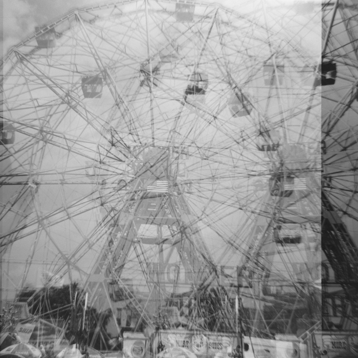
7. FRAME OVERLAPING
Much like the wear and tear that can occur on shutters, other mechanical parts in a film camera can bend or crack with time and use. This can lead to irregular advancing on your film which will cause your images to overlap. This usually occurs if the indented wheels are damaged. Beware, there are some film cameras that are made of plastic or were built in the time of the old USSR that don’t have a very good reputation for lasting.
As soon as you notice your images overlapping, you can be certain that it will happen with every roll of film you shoot on that camera thereafter. So you might want to pay a visit to your favourite camera repair maestro and see if it’s worth fixing, cause sometimes the repair might be a bit pricey!
*This can also happen if the sprockets of your 35mm film are damaged, but if that does happen your friendly film lab will see it immediately and let you know.

8. X RAYS
Pretty much everything is scanned by x-rays prior to getting on a plane, that includes both check-in luggage and any carry-on baggage. Film is sensitive to radiation, however technology has advanced significantly and consequently the way that things are scanned today is not the same way they were scanned 20 years ago. In most European countries the x-rays used for carry-on baggage are much milder and usually safe for anything below 800 ISO film. However, the x-ray scanners used on large luggages are much stronger and much more aggressive. This is why we recommend that you DO NOT put your film (exposed or not) in your check-in luggage when you’re flying. Always keep it in your carry-on baggage!
If your film is exposed to excessive amounts of x-rays, you will notice wave-shaped marks repeatedly along the negative and the images will display a lot of grain, fog, muted colors and a loss in the detail of shadows. To get a bit of an idea of what it looks like check out this (old) Kodak article that illustrates it fairly well.
*If you still want to ensure your film is protected from x-rays you can purchase lead bags for your film, but be aware that you will be hand checked by airport security for sure!


9. MOISTURE
Since film has a yielding surface it must be protected from many elements that could negatively influence the outcome of your images. In this instance, we’re specifically referring to drastic temperature changes that can cause condensation or moisture to occur onto the film surface, or your film coming into contact with any water or liquids. In order to achieve optimal results, film should not be in contact with any liquid or moisture until the moment of developing (unless you’re into experimenting, than go ahead!) The problem with any moisture or liquid that comes into contact with your film is that it will sit on your film for a significant period of time and alter the images. And in regard to 120 film, any moisture or water will damage the film and the backing paper it lays on.
It is generally recommended to keep film refrigerated if you’ll have it around for awhile, but be careful not to put it near the back of the fridge where water tends to condensate! Are you looking to preserve your film for longer than the average storage time? You can freeze it as well! The colder the film is, the less chemical ageing will occur to your film. But keep in mind that if you choose to freeze your film, you’ll need to wait about 1.5 hours after you take it out of the freezer before you can shoot it!
Therefore, we recommend that you:
1.Avoid long term storage at relative humidities of 60% or above. Such high humidities can damage the labels and paper back of 120 (from moisture and mold) and can rust the cans of 35mm. Also keep your film in its original packaging until you are ready to use the film.
2.Keep your film in the fridge. If you’ll use your film film stock within 3 months, temperatures of 13°C or less are appropriate. If your film stock will be kept longer than 3 months, freezing at -18° to -23°C is recommended. After any cold storage, be sure to allow your film to slowly adjust to the ambient temperature in which it will be used.
3.Do not keep film in your camera longer than necessary. Process your film as soon as possible after exposure, that will ensure the best possible quality for your images!


10. EXPIRED FILM
The silver halides that make film light-sensitive are modified by a chemical reaction when exposed to light or other forms of radiation. The sensitivity of the silver emulsion in film can degrade or “rust” over time. When it degrades, it will decrease the regular ISO value that the film would have had, had it not expired. For example, a film that was originally 400ISO but is expired by over 5-6 years, would be around 100-160ISO. On top of that, the decrease of ISO is also coupled with a decrease in contrast and saturation, and introduces possible color shifts and an increase of the grain in your film.
You can compensate for the age of the emulsion by overexposing your film in order to add more light to your images which will also add saturation and contrast. The result won’t ever be as good as if the emulsion didn’t expire but that’s just one of the magical qualities of film : ) Don’t let anybody tell you otherwise, expired film is perfectly usable! In fact, we’ve shot B&W film that expired in 1992 and it worked absolutely perfectly! Color is a bit trickier but the option is still there to experiment!


Hopefully this little guide has helped you understand a little better the flaws and mishaps that can sometimes occur to film. We believe that these intricacies are a part of the film process and can sometimes be harnessed as creative tools to make something really spectacular! But that’s not always the case and when these issues aren’t desired they can be a bit of a pain in the ass.
Got a question about a specific flaw or issue you found on your film? Drop us a line at ask@carmencitafilmlab.com! Even if we haven’t developed or scanned your roll in our lab, we might be able to help you find out what caused it and how to fix it.
We are here to help 🙂


-19")
-13")
-7")
-3")
-2")


 Pentax 67ii + Kodak Ektar 100


 Canon 1V + Kodak Ektar 100
 Contax 645 + Kodak Ektar 100
 Contax N1 + Kodak Ektar 100