New Film Scan Options: Noritsu HS-1800
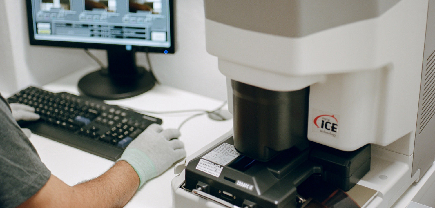
We are always looking at how we can improve the work we deliver and the services we offer, the Noritsu was clearly the next step to take as a professional lab and that’s the reason we are writing this article today. It was a bit of an unknown process due it’s a different approach to scanning from the one we are used to; but considering that moving forward is something written in our DNA, the decision was made!
We’ve waited until we’ve tamed it and now the time has come for you try it for yourself =)

The Features
We believe it’s not fair to say that the Noritsu it’s just a better or worst scanner, might be a slight different flavor than the one you are used to, but we believe beauty relies on the difference and uniqueness of each look. Now, we have a tool that allow us to do things that were just not possible before and we believe you’ll probably like them as much as we do!
The first thing the Noritsu is probably most known for is its size, due its scanning nature the scanner allows us to output files up to 5000px wide and 6500px(645)/7500px(35mm) long. Yes, that’s a BIG print!
For the geeky photographers out there like us, the Noritsu HS-1800 is able to output 16 bit files which means a wider color range between transitions and gradients.
And last but not least, if you are mad about shadow detail and smoothness this is definitely the scanner for you =)
Side by Side
We have carefully selected some images that we believe can best represent the characteristics of both scanners in different light situations. There are dozens of comparisons out there so we didn’t want to simply do a side by side comparisons on a couple images, that’s why we will explain a bit about what we appreciate on every frame and with that, you can draw your conclusions.
Please be aware these images are edited to match each other, as usually the tones will drift a little on each scanner and contrast on highlights and shadows usually differ a little. Make sure to read all our thoughts on it till the end of the article to get a better idea of what we feel about them =)
Highlights and Shadows

by Ana Lui
– Imagine that if you could raise the “Clarity” around +15 on a Noritsu scan, you would probably end up with something similar to the Frontier’s shadow contrast, it might appear “sharper” but don’t fool yourself, it has more contrast and because of that it seems like it has more definition, but if you would zoom at a 100% you would see more texture on the Noritsu. What we end up is with a softer image on the Noritsu, less “punchy” for instance, but on the highlight areas the Frontier tries harder to keep detail and so it flattens the image a bit, which helps to keep all the detail.
The palette goes a bit reddish on the Noritsu side but in this case it’s not a huge jump from one and other.
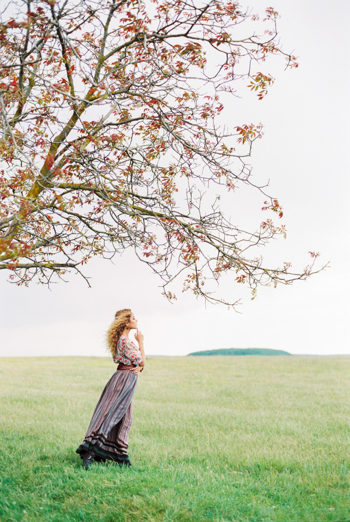
Shadow Color

by Pia Clodi
– Remember the reddish tone we mentioned above? Well here you can also appreciate it a bit, the color drifts a bit less in the Noritsu and it’s a bit more consistent on the overall image, also the contrast is a bit more “open”. Again we also appreciate a softer image on the Noritsu but it’s surprising to see how it keeps the color of the skirt and the left leg beneath it.
The punch is on the Frontier, there´s no question about it. Stronger contrast and colors that pop a bit more, mainly the blues, but if you are looking for a more realistic image then the Noritsu will probably be your new best friend.
Overall Sharpness

by Micmojo
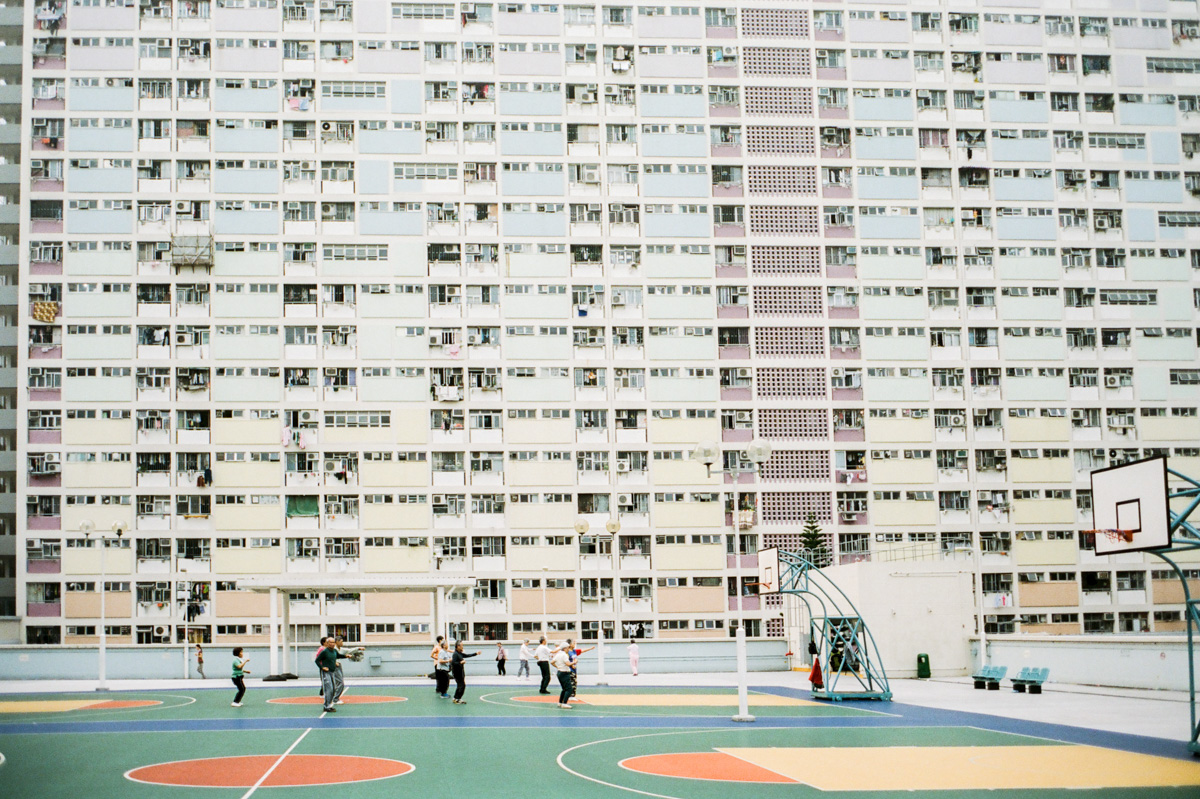
– A classic example on how the tones are split and the sharpness (or feeling of an unsharp mask) can be noticed on the Frontier. Even though it doesn’t feel imposed, the contrast on the edges is higher on the Frontier.
If you are looking for a wider scan that you can play more with perhaps you will feel more driven to the Noritsu, you could get really close to the results on the Frontier from the Noritsu but not viceversa. Again, it’s all about the pop here. Pay attention to the greys on the floor, you can quickly notice how the color tones differ more there from one scanner to the other, on the Noritsu it feels more monochromatic than the Frontier, where shadows often go to different colors rather than grey.
Skin Color

by Micmojo
– Both scanners can perform really similar even though the differences we mentioned earlier. Taking it from previous images, you can notice oranges go a bit more on reddish on the Noritsu, and perhaps even a bit magenta sometimes, in here there is slight difference on the brighter part of the image, the Frontier appear to have higher highlights and that translates into a bit more contrast.
In this case, with the side by side comparison we can barely see any differences, we really have to put an effort on it and it’s really not the point of the image, but this is just a case of course and remember we did some adjustments to try to output as similiar as possible images on both scanners.
The Overall Feeling

by Micmojo
– This image sums up a bit of everything we’ve been talking before, the funny thing is, upsidedown. We’ve been mentioning on every image that Noritsu pretty much produces a softer image, but in this image we feel it’s not completely true, when it comes to shadows here the Noritsu has a richer contrast on the lower end of the greyscale. Pay attention to the backlights of the motorcycle at the center of the image for instance
In images with such a huge difference between highlights and shadows and where most of the content is on the grey areas the Noritsu outputs a bit better contrast between elements and also colors than in the Frontier; nevertheless you can see a more monochrome tone on the shadows, even a bit greenish (can be corrected by split toning though) when in the Frontier we can see some shades of magenta. And yes, we are being really nerdy/geeky/freaky here =) Also, can you spot the difference on the skin tone? Yup, a bit more on the reddish side on our new friend from Japan.
Seeing the forest for the trees
Moral of the story? Well, we feel like it’s the overall feeling that matters the most, you can be get really really geeky if you like, but you might end up not seeing the forest for the trees. Take a step back and try to decide by gut feeling which ones you feel more drawn too. In our humble opinion if you are you like to have room for edition or you really are involved in a project where your voice is crucial and you need to give the final paint brushes yourself the Noritsu would be the way to go.
On the other side, if you feel your look it has to be more finished, contrast is over detail in your images and you love how tones differ a bit on shadows, highlights and from image to image the Frontier is your battle horse.
And wait, we are not done just yet…
How it looks on the Noritsu
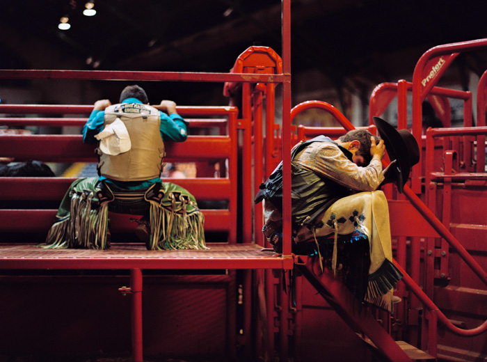
After many testing we came to the conclusion that side by side comparisons are not always the most accurate method to decide, the reason is, both scanners can perform really different or really similar depending on the frame. That’s why we want to show you a handful of images that we believe represent the best the output of the scanner, so you can get an overall feeling and choose between them.
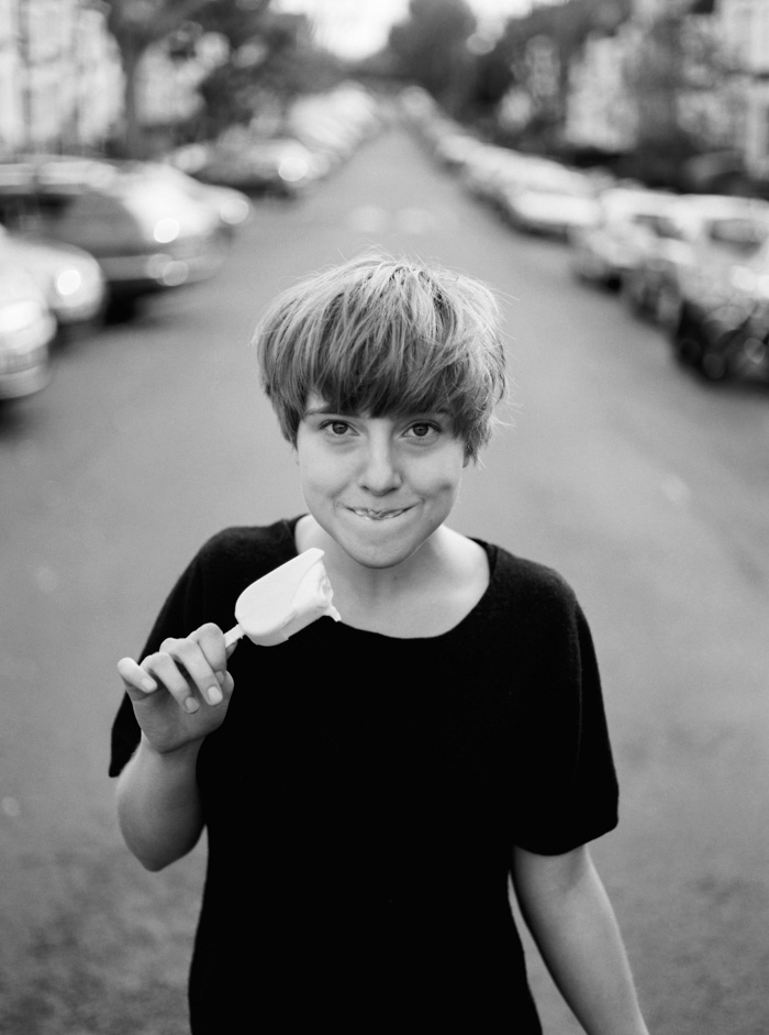
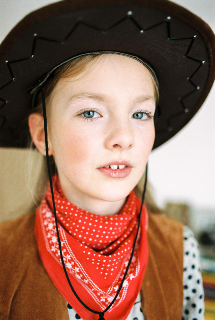
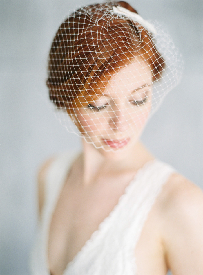
As you might see, the Noritsu sometimes have a “cleaner” look, more consistent, with less contrast and more texture on the grain. One of the difference we see is that on the Nortistu you can sometimes see a bit more vivid greens than in the Frontier.
It works specially well on landscape and architecture, when the images have a high dynamic range the Noritsu allows us to output a neutral image that keeps plenty of detail in all the areas; this perhaps it’s a look that it’s often seen in artistic projects or essay photography. If you admire the work of photographers like Stephen Shore, Joel Sternfeld or Alec Soth and so on you might feel more driven to this scanner.
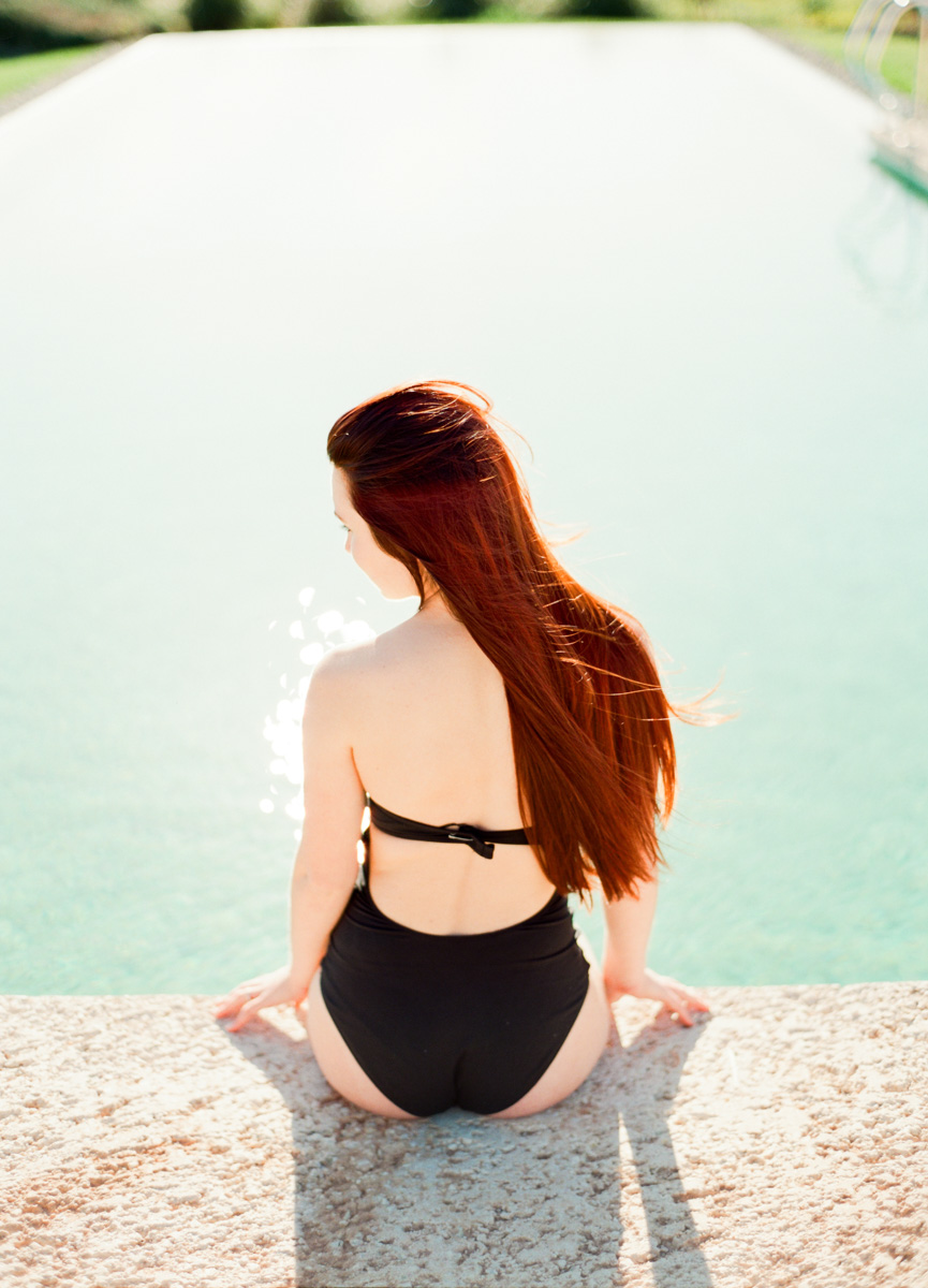
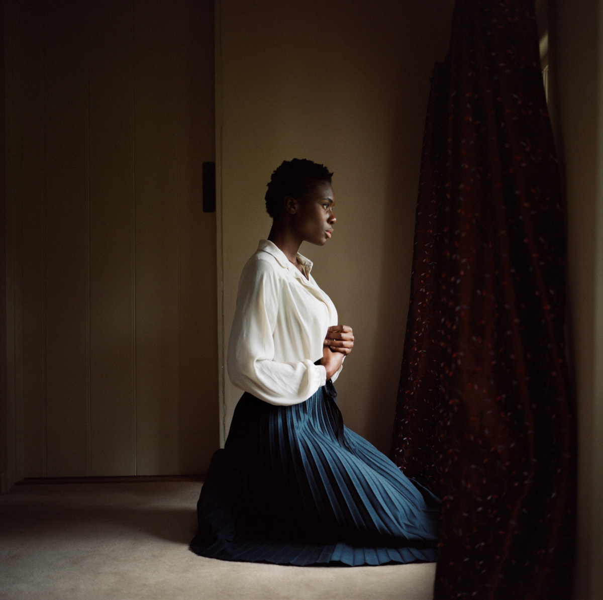
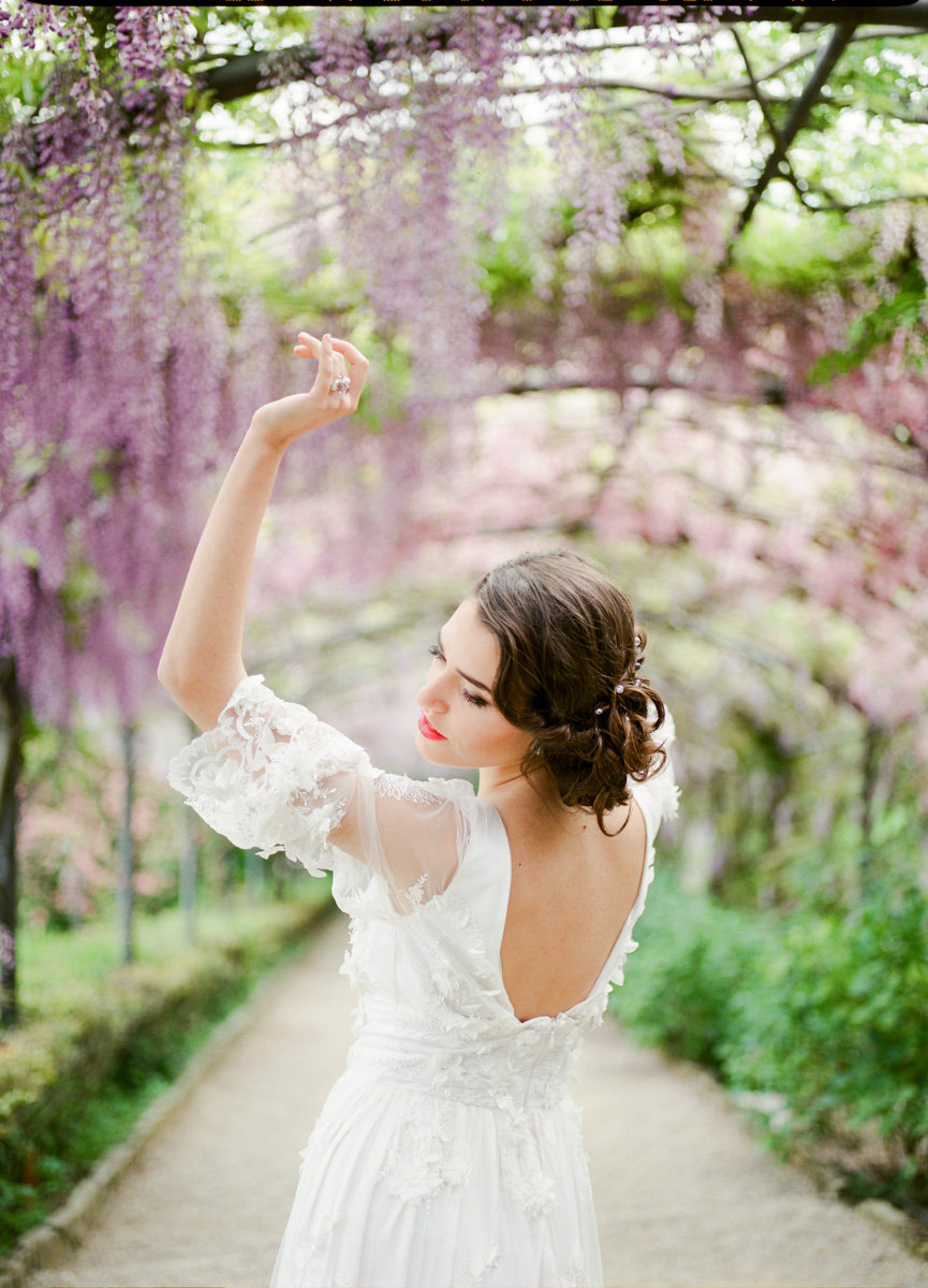
Nevertheless the Nortisu performs great on wedding work and portraiture. We’ve been working closely with Jan Scholz (aka Micmojo) to explore the posibilites of the scanner and after a few samples he made the switch without doubts. Rather than saying better or worst, we prefer to see it as different choices to get one look or another. Check out the gallery and judge for yourself!
How it looks on the Frontier
What else do we need to say to say about the Frontier? If you’ve seen work scanned by us in the last 3 years it’s been done over the Frontier. It performs great on skin tones, and it keeps highlight detail over everything else and it has this classic look; vivid tones and punchy contrast.
As much as we love it we know there is other possible looks that can be given to the negatives; the frontier does often colder greens but it has a very strong contrast that comes with the way it interprets the image, sometimes it’s amazing and sometimes it’s funky. If you are all about consistency this is not your cup of tea, because it scans one image at a time and it shifts a bit the color and contrast on every frame. We work hard to correct it every time on the overall order but sometimes there is only so much we can do.
Printing
When it comes to large prints the decision is clear, for several reasons. The Noritsu outputs scans with more texture and you can actually see more grain structure in them, when that translates to paper it enhances the sharpness and the grain you see on the screen is gonna blend in with the paper texture and you won’t be able to see it at all. Sharp and crisp images even in large prints are now possible at affordable scan price!
The Frontier can perform good in prints up to 50x70cm in our experience but larger than that it starts to soften up, mainly due it’s resolution limitation and you have to think the Noritsu was engineered to work along a minilab with paper width up to ~30cm.
So if you need to enlarge some work and print it big check out the XXL scans!
Conclusions
Our opinion? There is not a better scanner per se, as a lab we see it as 2 different tools to get closer to a specific look. In the same way you choose Kodak or Fuji, Contax or Pentax you can know choose Frontier or Noritsu. That being said we encourage you to try it and judge it for yourself, because that is the best way to find out what is the best method to get the look you seek for.
The Frontier is sure shot, we know all it’s tips & tricks by now and if you love the look that you’ve seen from us during this last 3 years, that’s probably the scanner to go. But as much as we loved and love the Frontier, which was the reason this whole adventure started in Valencia, we are terribly curious to see how far we can push the Noritsu and it’s capabilities! We like what we’ve seen from it so far and we know by heart that this is only the beginning, as longer we keep working on it the better we’ll get and best results will outcome. We are using all our color knowledge and experience on it, and at the same time we feel like we are learning many new things every week. The best of it? This can only translate into better scans for everyone!
As you may see, now on the Order Form you can choose which scanner you prefer to use, but this can be a bit hard to decide that’s why, we added a 3rd option: Best according to your preferences, what does this mean? Well, through our experience we will choose the best scanner suited to match your preferences written on the Order Form or the reference images that you sent at looks@carmencitafilmlab.com. We believe this is the best option if you trust in our judgement =)
For us it’s the overall feeling that sets the difference, as a part of an analog process (perhaps this being the less “analog” part) every step in the chain matters and it’s hard to speak undeniable truths. We hope this little article helped you get a better picture of the capabilities and options on both scanners. Technically there is the resolution threshold between one and other but, as we say in Spain, there are as many preferences as different colors exist, the key really is to find yours.
Got questions? We love to hear them!
Email us or leave a comment below


















Thank you so much for this info. It’s possible to get the “more contrast and punchy colours look” of the frontier in the noritsu?
Yes
I own a Noritsu, your focus is off that’s why the images are soft.