Few Frames w/ Michael Ferire
A DIFFERENT BACKSTAGE
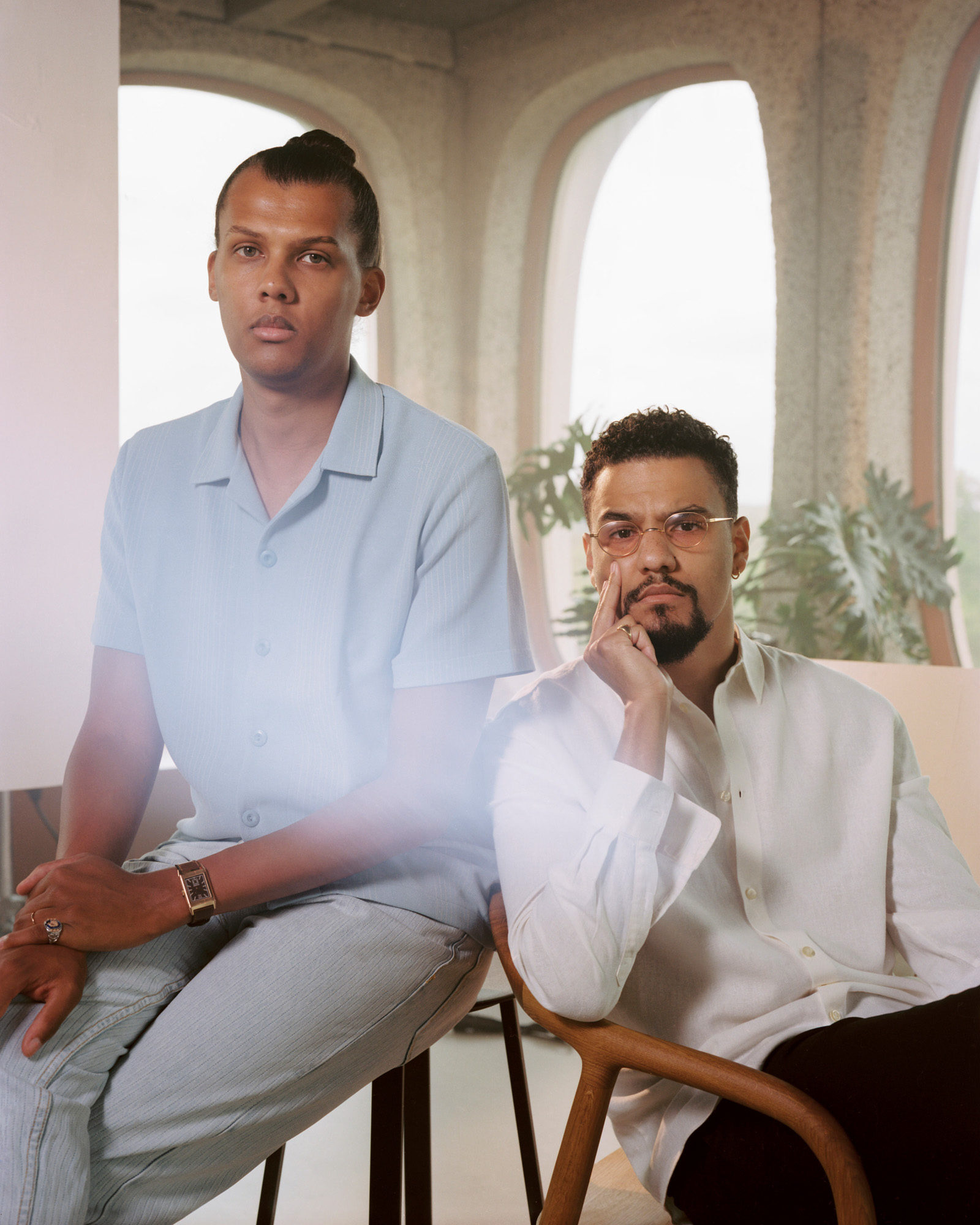
We’ve known Michael Ferire for a long time already, one morning a package with single frames cut into an old 10×15 photo album appeared with his name and asking us to do the best we could. Little we knew that was gonna become the beginning of a long relationship. Earlier this year he sent this shot he did with Stromae and the team behind his clothing brand Mosaert. It was a big shot combining 4×5″ film with 120 in 6×7 & 645 format and specially lit with studio lights.
Many years ago we asked Michael in a personal conversation how would he describe his photography, and he said: “I’m a backstage photographer“. Definitely not the answer that we could have anticipated, but it made total sense with his photography. Michael always tries to portray what’s behind of what we see, perhaps his background on psychology has something to do with that, and in this case, flipping the traditional concept of not being present in the image but rather being present to show what’s behind, in this case behind the brand of Mosaert.
In his words:
“The paradox of the project: being visible without being too present
This project was a bit crazy. The idea was to create iconic images that could be the expression of the creative label Mosaert (mainly known for the creative work they made for Stromae but also active in fashion design, video clips and other projects). For me, it was a total non-sens to be so accurate on the expression of the brand and the consistency of each project they make without having a proper vision on how to communicate on the team itself.
I presented, therefore, a global project based on the idea of bold images with a clear identity but I knew that the tricky part would be to make sure that these images will stay on the second level of communication. Mosaert needs to communicate clearly about their products and not specifically about themselves. So this shoot should provide the same aesthetics but stay more subtle and discrete.
Inspiration: timeless and bold
Artistic background: I really wanted to create pictures like a painter do it. So I decided to find inspiration mainly in art and more specifically in Art Nouveau or Art Deco. This aesthetic is already very present in Mosaert’s DNA and also representative of Belgium which is also a characteristic of this project. Artistic background came from different sources like MC Escher and Art Nouveau in general.
The place was very obvious since we wanted a retro-futuristic place with a very Belgian legacy. With Studio Elementaires (scenographers) we decided to amplify the graphic potential of the place using forms and counter forms to create an Atelier Brancusi mood. The idea was to create a very singular atmosphere taking inspiration in different artistic traditions. It had to be retro and futuristic at the same time.
For poses and attitudes, I wanted something bold and neutral at the same time which is a challenge. For me, it was clear that we had to consider bodies and faces as graphical elements in the construction of images. This solution would be able to provide the “neutral boldness” that we were looking for. I found inspiration mainly in Irving Penn’s work.
Light and mood: We wanted something very clean for the lighting. Something that would seem natural and supernatural at the same time. A mood somewhere in-between the organicity of the film and a clinical perfection that could be 3D images. The same paradox that we had in attitudes and poses : that « neutral boldness ». The aim, with Julien Charpentier (DOP in the film industry), was to create very soft and timeless light.
I also wanted to work with 4x5inch which is a format I never used and which seemed very technical and risky when it’s your first try. I decided to work with Elliott Verdier (that I met on Traveling Light last year). I knew that it would be the perfect solution to be able to do it without having the stress of all the technical aspects of large format and be more focused on the vision and the artistic direction.
We worked together as a team. For each pose, each idea, I shot it first in 120 using different framings and poses. At the end of my 2 rolls (Contax 645 + Pentax 67) we chose with Elliott the best option within those I did and we shot it in 4×5. Basically approximately 15 different ideas which mean 30 rolls and 15 Large Format images. ”
– Michael Ferire
LAB NOTE
This was an exciting challenge for us because it combined two film formats that cannot be scanned on the same scanner, 4×5″ & 120 film. With Michael we have been working a lot on the Noritsu HS-1800 lately cause it enables a much more sophisticated look, and it’s actually a perfect match for the 4×5″ film, which we scan it with our Fujifilm FineScan 2750. Both scanners use a similar technology, and it translates into more flat files that allow for a vast dynamic range and exploring different tonalities. For this shoot, since it was lit with a full light set up plus some natural light, it was a challenge to balance all the different light temperatures along the different skin tones. Thanks to the wide tonal range of the Portra plus the scanner allowed for a great control and fine tunning from our end and Michael’s. The result is a very interesting look that is soft while at the same time having a lot of volume thanks to the exquisite illumination work.
120
4×5


